
Introduction
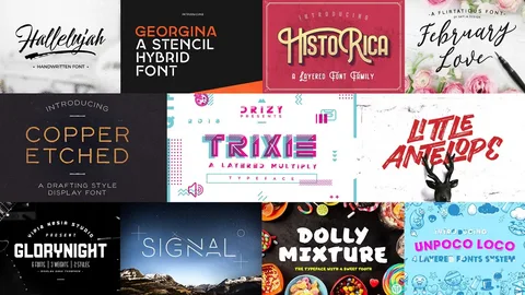
English fonts are an essential part of modern communication, graphic design, branding, web development, publishing, advertising, and digital content creation. A font does much more than display words on a screen or page. The right typeface can communicate personality, establish visual hierarchy, improve readability, and influence how an audience perceives a message. From elegant serif fonts and modern sans-serif styles to handwritten scripts, decorative typefaces, and minimalist designs, English fonts offer countless possibilities for creative projects.
The growing popularity of digital design has made font selection more important than ever. Websites, social media posts, business logos, presentations, advertisements, product packaging, YouTube thumbnails, posters, invitations, and mobile applications all depend on typography to communicate effectively. Choosing an appropriate English font can make a design look professional and polished, while an unsuitable font may make the same content difficult to read or visually confusing.
This comprehensive guide explores English fonts, their major categories, practical applications, typography principles, font pairing techniques, web fonts, branding considerations, licensing, and emerging trends. Whether you are a beginner, graphic designer, website developer, student, marketer, or business owner, understanding how English fonts work can help you create more attractive and effective visual content.
What Are English Fonts?
English fonts are typefaces designed to display the Latin alphabet commonly used for writing English. They include letters, numbers, punctuation marks, symbols, and sometimes additional characters required for international languages.
The term “font” is often used interchangeably with “typeface,” although technically a typeface refers to the overall design of lettering while a font traditionally refers to a specific style, weight, or digital file within that typeface family.
English fonts can vary dramatically in appearance. Some have traditional decorative strokes, while others are clean and minimal. Some are designed specifically for long reading passages, whereas others are created for logos, headlines, posters, and artistic projects.
Why English Fonts Matter
Typography influences both communication and visual identity. Even when the written message remains exactly the same, changing the font can completely alter its appearance and emotional impact.
Professional typography can:
- Improve readability.
- Strengthen brand identity.
- Create visual hierarchy.
- Communicate personality.
- Make content more memorable.
- Improve website usability.
- Enhance advertising materials.
- Create a professional appearance.
For this reason, choosing a font should be considered an important part of the design process rather than an afterthought.
Main Types of English Fonts
English fonts can generally be divided into several major categories. Each category has its own characteristics and practical applications.
Serif Fonts
Serif fonts contain small decorative strokes at the ends of letters. They are traditionally associated with printed publications, books, newspapers, and formal communication.
Serif typography can create an impression of:
- Tradition.
- Authority.
- Elegance.
- Reliability.
- Sophistication.
These fonts are particularly useful for editorial designs, formal documents, literary projects, and established brands.
Sans-Serif Fonts
Sans-serif fonts do not have decorative strokes at the ends of letters. Their clean appearance makes them extremely popular in modern digital design.
They are commonly used for:
- Websites.
- Mobile applications.
- Presentations.
- Business documents.
- Digital advertisements.
- User interfaces.
Sans-serif fonts often communicate simplicity, modernity, and clarity.
Script Fonts
Script fonts imitate handwriting or calligraphy. They can create a personal, artistic, or elegant appearance.
Common applications include:
- Wedding invitations.
- Luxury branding.
- Greeting cards.
- Creative advertisements.
- Personal logos.
- Social media graphics.
Because script fonts can sometimes be difficult to read, they are generally better suited to short text rather than large paragraphs.
Display Fonts
Display fonts are designed primarily for attention-grabbing text. They often feature unusual shapes, decorative elements, or highly distinctive styles.
They work well for:
- Posters.
- Headlines.
- Event promotions.
- Product packaging.
- Social media graphics.
- Creative campaigns.
Display fonts should generally be used selectively so that they do not overwhelm the design.
Monospace Fonts
In monospace fonts, eveny character occupies the amount of horizoptal space. They are strongly associated with programming, terminals, technical documentation, and coding environments.
They can also be used creatively in:
- Technology branding.
- Editorial designs.
- Digital interfaces.
- Technical presentations.
Their consistent spacing provides a distinctive visual appearance.
Choosing Fonts for Websites
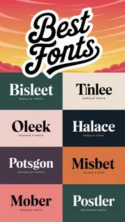
Typography is especially important in web design because visitors need to read information quickly and comfortably.
A good website font should offer:
- Excellent readability.
- Appropriate character spacing.
- Multiple weights.
- Good screen rendering.
- Compatibility across devices.
- Reasonable loading performance.
Large blocks of text usually benefit from simple and highly readable typefaces.
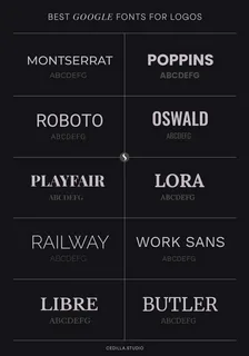
Font Selection for Logos
Logo typography requires a different approach from ordinary body text. A long font should reflect the personal of the brand and recognizable at different sizes.
A technology company might choose a clean modern sans-serif, while a luxury business may prefer an elegant serif or sophisticated script.
Important considerations include:
- Brand personality.
- Target audience.
- Industry.
- Legibility.
- Scalability.
- Uniqueness.
A strong logo font should remain effective across websites, packaging, business cards, advertisements, and social media profiles.
English Fonts for Social Media
Social media designers frequently use fonts to make posts more visually engaging. Typography can help important words stand out and create a recognizable content style.
Fonts can be used for:
- Instagram graphics.
- YouTube thumbnails.
- Facebook posts.
- Promotional banners.
- Quote graphics.
- Short videos.
- Digital advertisements.
However, readability should always remain a priority. Decorative typography may look attractive but become difficult to understand when displayed on smaller screens.
Font Pairing
Using two or more fonts in the same design is known as font pairing. Effective pairing creates hierarchy and visual contrast.
A common approach is to combine:
- Serif heading + sans-serif body.
- Sans-serif heading + serif body.
- Bold display font + simple body font.
- Script accent + clean sans-serif.
The goal is to create contrast without making the design appear inconsistent.
Understanding Font Weight
Font weight describes how thick or thin the characters appear.
Common weights include:
- Thin.
- Light.
- Regular.
- Medium.
- Semibold.
- Bold.
- Extra Bold.
- Black.
Different weights can create hierarchy within the same font family. For example, a bold weight may be used for headings while regular text is used for paragraphs.
Understanding Font Size
Font size affects readability and visual hierarchy. Headlines generally require larger sizes than body text, while captions and supporting information can use smaller sizes.
Designers should consider:
- Screen size.
- Reading distance.
- Audience age.
- Content type.
- Platform requirements.
Responsive websites should adjust typography appropriately for different devices.
Font Licensing
One of the most important considerations when using English fonts is licensing. Not every font available online can legally be used for commercial projects.
Font licenses may specify whether a typeface can be used for:
- Personal projects.
- Commercial designs.
- Websites.
- Logos.
- Printed products.
- Applications.
- Redistribution.
Designers should always check the license before using a font commercially. Using licensed or appropriately free fonts helps prevent legal and business problems.
Free vs Premium English Fonts
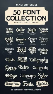
Thousands of free fonts are available online, while premium fonts are sold by professional type foundries and marketplaces.
Free fonts can be useful for:
- Personal projects.
- Student assignments.
- Small websites.
- Social media graphics.
- Experimental designs.
Premium fonts may provide:
- Larger character sets.
- More weights.
- Professional kerning.
- Extended language support.
- Specialized styles.
- Consistent design systems.
The best choice depends on the project’s requirements and budget.
Fonts and Brand Identity
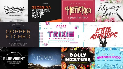
Typography can become an important component of brand recognition. Businesses often establish typography guidelines alongside colors, logos, photography, and other visual elements.
A consistent font system helps maintain a unified appearance across:
- Websites.
- Business cards.
- Advertisements.
- Presentations.
- Packaging.
- Social media.
- Printed documents.
Consistency makes a brand easier to recognize.
Improving Readability
Good typography should make information easy to consume.
Designers can improve readability by:
- Choosing appropriate font sizes.
- Maintaining sufficient line spacing.
- Avoiding overly decorative body fonts.
- Using adequate contrast.
- Limiting excessive font combinations.
- Creating clear headings.
- Maintaining comfortable paragraph widths.
Readability becomes particularly important for long-form articles and educational content.
English Fonts for Professional Documents
Professional documents generally require simple, readable typography. Business reports, resumes, proposals, academic assignments, and official correspondence should prioritize clarity over decoration.
A clean serif or sans-serif typeface is usually more appropriate than an elaborate display font.
Professional typography creates an organized appearance and allows readers to focus on the information rather than the design.
Typography and User Experience
Typography directly influences user experience. When text is difficult to read, visitors may leave a website even if the information itself is valuable.
Good typography contributes to:
- Better comprehension.
- Longer reading sessions.
- Easier navigation.
- Improved accessibility.
- Stronger visual hierarchy.
Website designers should therefore treat typography as part of the overall user experience rather than simply a decorative element.
English Fonts in Digital Marketing
Marketing campaigns rely heavily on visual communication. Fonts can influence whether an advertisement appears trustworthy, energetic, luxurious, playful, or professional.
Typography can help establish the desired emotional response while highlighting important information.
Marketing designers should ensure that fonts remain:
- Consistent with the brand.
- Easy to read.
- Appropriate for the target audience.
- Compatible with the campaign’s visual style.
Common Font Selection Mistakes
Several common mistakes can reduce the quality of a design.
Using Too Many Fonts
Combining too many typefaces can create visual confusion.
Ignoring Readability
A beautiful font is not useful if the audience cannot comfortably read it.
Using Decorative Fonts Everywhere
Display and script fonts are generally better for accents and headings than long paragraphs.
Ignoring Licensing
Using fonts without understanding their licenses can create legal problems.
Poor Font Pairing
Fonts should complement one another rather than compete for attention.
Future Trends in English Fonts
Typography continues evolving alongside digital technology and design trends.
Emerging developments include:
- Variable fonts.
- Responsive typography.
- AI-assisted font creation.
- Personalized typefaces.
- Animated typography.
- 3D lettering.
- Interactive web typography.
- Improved accessibility.
Variable fonts are particularly useful because one font file can support multiple weights and styles, potentially improving flexibility and web performance.
SEO Importance of the Keyword “English Fonts”
The keyword “English Fonts” represents a broad search topic with applications across graphic design, web development, branding, typography, social media, and content creation. Creating comprehensive, original content around English fonts can attract users searching for font categories, typography advice, font combinations, design inspiration, and practical usage information.
Effective SEO for this topic should include natural keyword placement, descriptive headings, useful explanations, internal links, optimized images, fast page performance, and content that answers specific user questions.
How to Choose the Right English Font
The best font depends on the project’s purpose. Before choosing a typeface, consider the audience, medium, brand personality, readability requirements, and overall design style.
Ask yourself:
- Who will read the content?
- Where will the font be displayed?
- Is readability the main priority?
- Does the font match the brand?
- Is the licensing suitable?
- Will the font work at different sizes?
- Does it support the required characters?
Answering these questions makes the selection process easier and more effective.
Conclusion
English fonts are an essential part of modern design and communication. From traditional serif typefaces and clean sans-serif fonts to elegant scripts, creative display styles, and technical monospace designs, each category serves a different purpose. Choosing the right font can improve readability, strengthen branding, enhance user experience, and make digital or printed content more visually appealing.
As design technology continues to develop, typography will become even more flexible through variable fonts, responsive systems, artificial intelligence, and interactive digital experiences. Whether you are designing a website, creating a logo, preparing a presentation, publishing an article, or developing social media content, understanding English fonts will help you communicate your message more effectively and create designs that are both attractive and professional.











Leave a Reply